Ecommerce Site Search Best Practices with Examples

Ecommerce Site Search Best Practices with Examples
Ecommerce Site Search Best Practices with Examples
A lot of people don’t know the value of ecommerce site search when it comes to converting browsers into buyers.
Many retailers treat onsite search as a necessity, and don’t recognise its potential as a powerful money maker.
I’m writing here to change that.
You see, your shoppers use your site’s search function to find something they want. The smarter your search engine, the more likely your browsers will become buyers.
But there’s more to search than the ability to provide accurate search results. That’s just the start.
Search plays an essential role in the shopper’s relationship with your brand and their experience. They expect to be able to find what they’re looking for and navigate your site seamlessly.
Does your site meet the standards they expect? In this article we look at 14 ecommerce site search designs that have been proven to reduce bounce rates, boost conversion, and maximise sales.
What is Ecommerce Site Search?
Firstly, let’s look at what ecommerce site search is and why it’s so valuable.
Ecommerce site search allows web visitors to query your database and get answers to questions they might have about your products or services.
The more optimised the search engine, browsers can find the information they’re searching for easier and faster.
Think of an ecommerce search engine as a shopping assistant. It is able to answer any question your shoppers might have, provide recommendations, and help guide them through the path to purchase.
In a very comprehensive study by Baymard Institute, shoppers fall into one of eight search categories:
- Exact search: where the shopper knows the product they want (i.e. PlayStation 4)
- Product type search: where the shopper looks for a product type rather than a specific brand or model (i.e. smart phone)
- Symptom search: where the shopper looks for a solution to a problem rather than a specific product (weight loss pill)
- Non-product search: where the shopper looks for information rather than a product (i.e. next day delivery)
- Feature search: where the shopper looks for a specific product feature (i.e. leather jacket)
- Thematic search: where the shopper includes thematic qualifiers liberally in their searches, (i.e. christmas gifts)
- Compatibility search: where the users look for products compatible with another (i.e. iphone 13 case)
- Slang, abbreviation, and symbol search (i.e. shades instead of sunglasses)
The best ecommerce site search engines can deliver on these types of searches, and help shoppers find exactly what they want to buy, or the information they’re looking for.
But the reality is that an estimated 42% of ecommerce sites are currently seriously lacking in their search capabilities.
Why is site search so important in ecommerce?
Earlier on, I wrote that an ecommerce site search function is pretty much a digital shopping assistant, guiding the shopper to the product they’re looking for.
When a shopper arrives on your site, they’ve effectively entered your store. When they engage with your search bar and enter their query, they’ve asked your shopping assistant a question. It’s up to the results they get, the quality of the results, and the overall experience that will make or break your relationship with them.
What are the benefits of ecommerce site search
Your ecommerce site search tool is then one of the most important converting assets of your online store. We’ve found that conversion rates rise 20% with our clients.
Why? For a range of reasons, but ecommerce site search helps people what they’re looking for faster, personalises the shopping experience, empowers retailers with customer interest data, and more.
So why are so many ecommerce sites neglecting it?
At this point, you might be asking ‘does my site have the most comprehensive search user experience possible?’
In a nutshell, you want your search function to make your product and service easy to find, select, and purchase.
Well, find out with our top tips for ecommerce site search best practices.
1 Make sure site search is highly visible and large enough for queries
Your shoppers need to be able to find your site search function easily. It should stand out. Take a look at one of our customers, office retailer, Equip4Work, below.
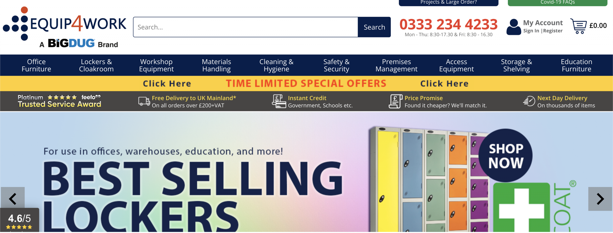
On Equip4Work’s site, we can see the search bar is front and centre. It is positioned right next to the brand’s logo. You can’t miss it.
There are several design elements to consider that will increase your search function visibility. Consider the position, style, and size of your search bar.
In terms of position, place the search field in the middle of the header, for aesthetic purposes while remaining prominent and easily discoverable.
In terms of search style, this will depend on your store and brand. But make sure you’re using contrasting elements that make the search field stand out.
In terms of size, this too depends on the type of store. The size of a company’s search bar can guide a user by nudging them towards various alternative search routes. For example, the fashion sector operates on a very visual level. As a result, they typically guide customers to navigate by category and reduce the size of their search bar.
2. Autocomplete, and ‘did you mean’ correction
Autocompletion is integral to a seamless customer journey within search. Ultimately, the role of autocomplete isn’t to speed up the process, but rather support users in their search.
Shoppers can’t be expected to know product names by default, how to spell names, or even what they’re looking for. Your search bar should be able to anticipate what the shopper is searching for and provide product or service suggestions before the user has even finished typing.
Take a look at apparel brand and customer, Pour Moi’s autocomplete capabilities below:
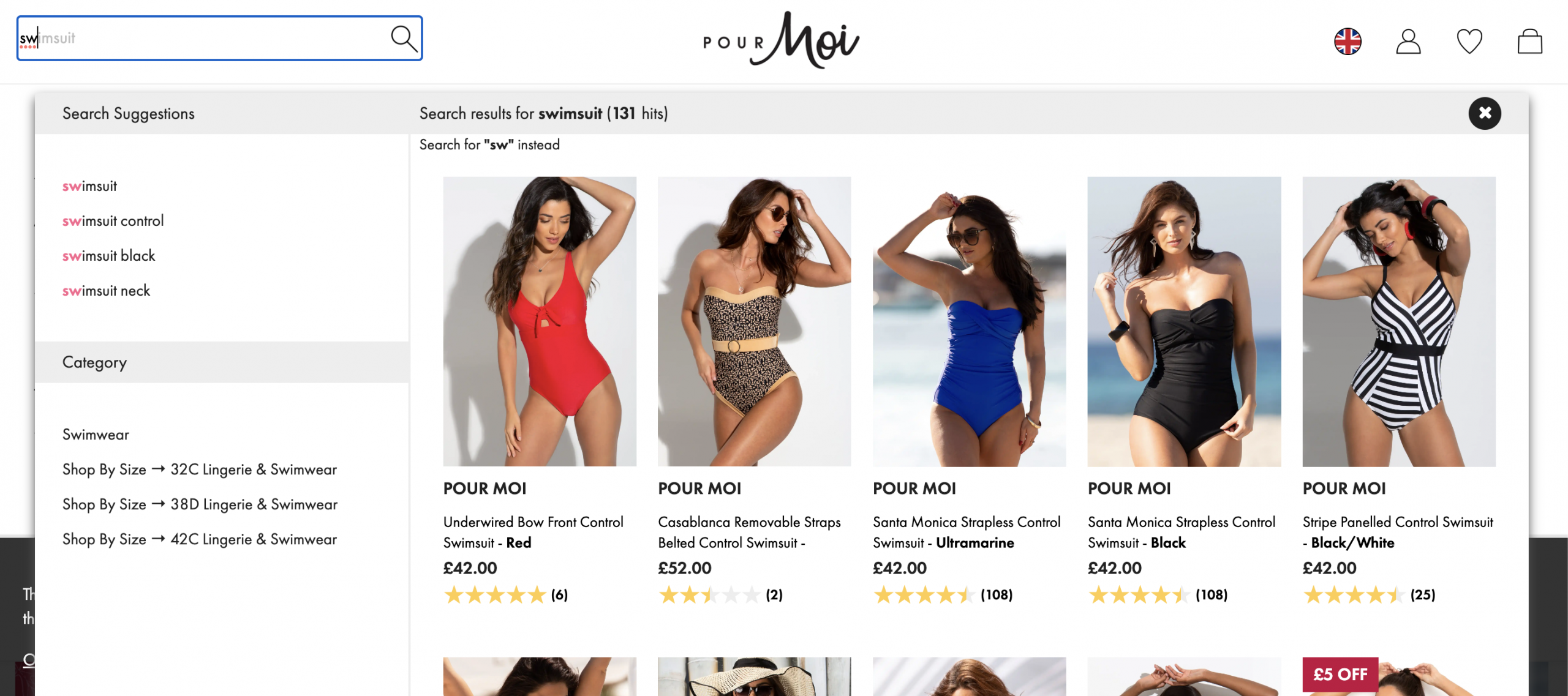
Pour Moi’s search tool offers relevant suggestions and image results related to the search term, despite the query not being typed out in full yet.
3. Eliminate dead ends
If your shoppers has searched for a product or service that you do not provide, do not simply kill the experience with an empty “0 results” page.
Your no results pages should give your shoppers the means to take another type of action on your site, and not simply tell them to try somewhere else.
Take a look at this no results example from Pour Moi:
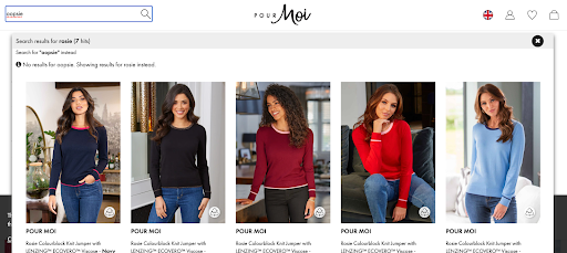
Here, the no results page provides options for the browser to try and find other products that may or may not suit their needs.
4. Make your search speak to your customers
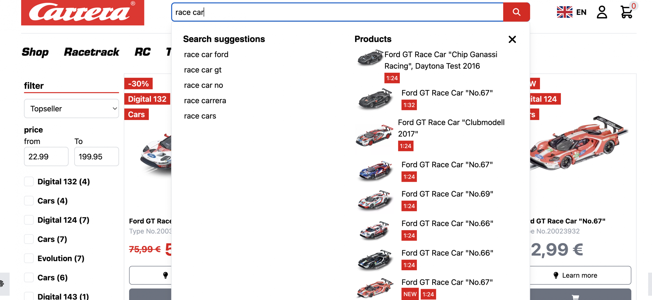
Unless you do business in a specialised niche, you should avoid esoteric terms and industry jargon and build a search engine that speaks your customers’ language.
If your shoppers are using generic terms, you should be using them too. Here’s Carrera Toys doing it right.
5. Autocorrect
Make sure your site search function is built to tolerate errors on the user’s part, such as misspellings.
As well as this, be sure that your search function is able to handle synonym search. Baymard reports 70% of ecommerce search engines can’t show useful results for synonym keywords for product-type queries.
Make sure your site search is optimised to understand phonetic misspellings and typos so simple mistakes don’t return an empty results page. Using natural language processing can boost search effectiveness by enabling interpretation of a query’s intended meaning and helping to parse the meaning of long, complex search queries.
6. Synonyms
Ensuring your search engine understands synonyms will help people find the products they’re looking for. In some search solutions, this is something you’ll need to add manually based on your needs; in others, these synonym libraries are built automatically using natural language processing (NLP).
Our favourite is the “hairdryer” vs “blowdryer” example.
Synonym search optimization is best done by including as many synonym keywords as possible in every one of your products’ metadata.
7. Collect analytics data for ecommerce search insights
A search bar doesn’t just have to be a means to an end for getting your shoppers from A to B. It has the capacity to be one of the most important KPI measurers on your website, telling you:
- The terms your shoppers are typing
- The results they’re being shown
- How different segments of your audience interact with your search bar.
- Queries with low CTR
- Queries with “Next Page” clicks
- Queries with no results
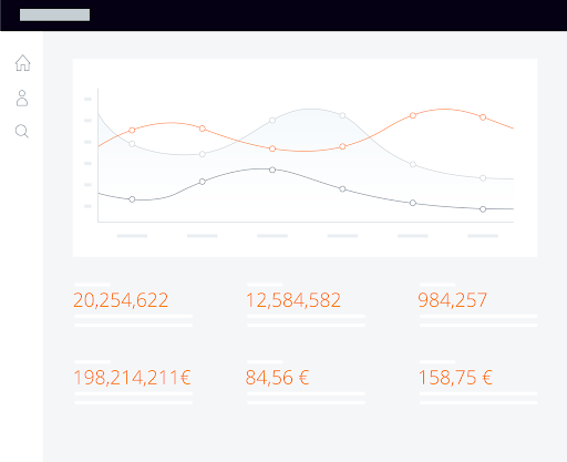
Make sure your search is giving you these insights and use your findings to optimise your entire shopping experience.
8. Provide search access to more than your products only
Your shoppers might still be in the research phase of their search, so it is not always appropriate to show them product listings, but instead categories. Ensure your onsite search function provides the desired data such as category overviews, technical data, and other relevant resources.
You should also include SKUs in search, making it as easy as possible for browsers wanting to find products and solve their problems, and navigate through your site.
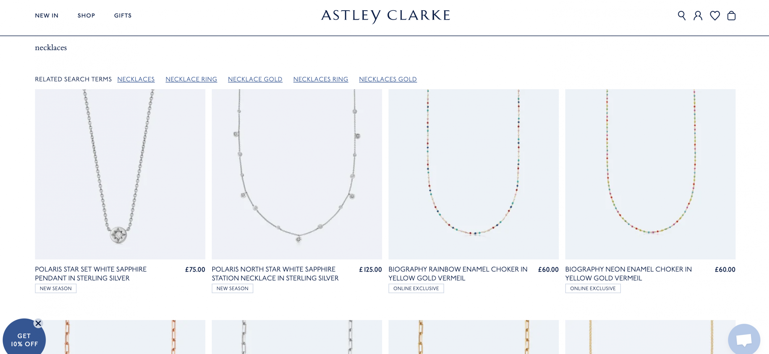
Jeweller Astley Clarke’s search allows users to toggle between different types of necklaces.
9. Provide advanced filtering and supplementary sorting options
Filtering allows your shoppers to search the way they want to search. Some might want to filter by values such as reviews, price, product type, category, and more.
Your site search should be able to accommodate this method of search. Usability is key to the customer experience, and contributes to retention.
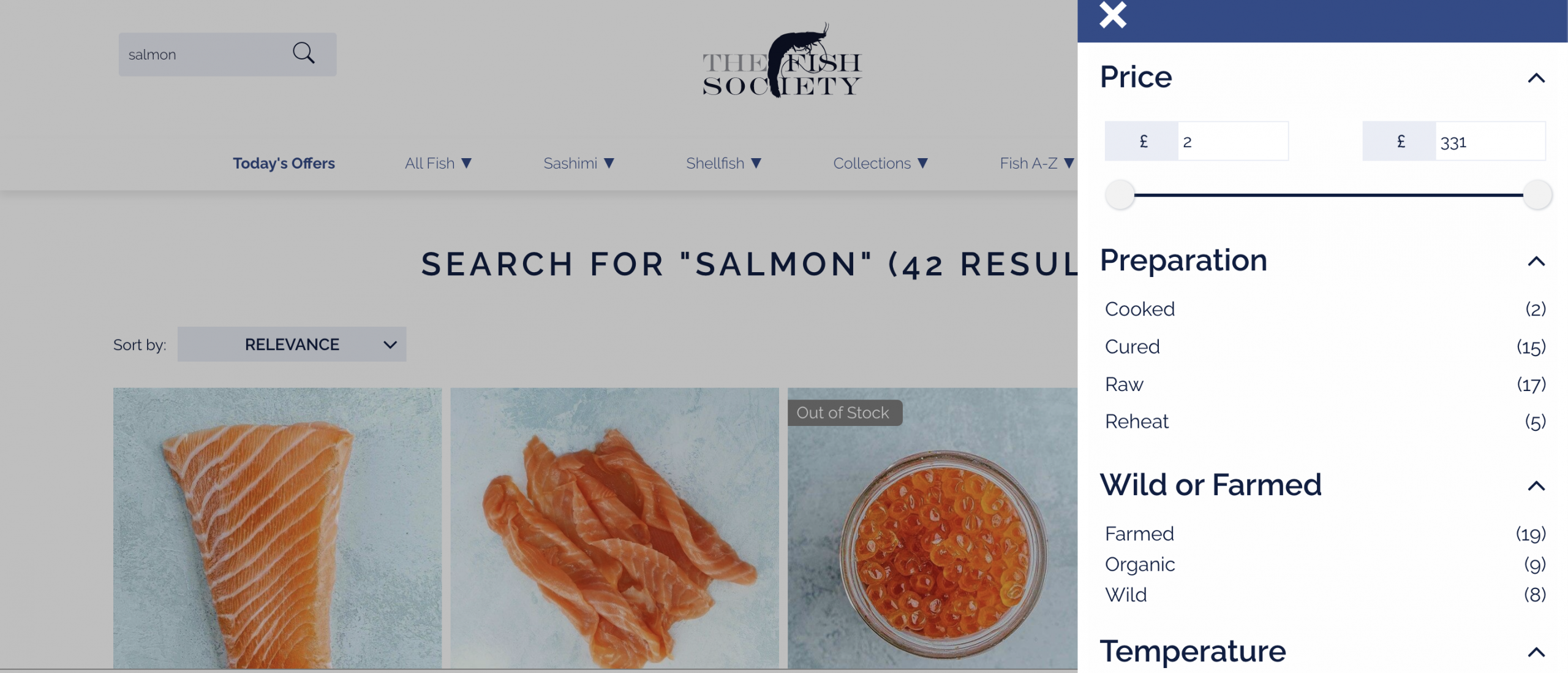
The Fish Society allows visitors to filter their products by preparation, sourcing, price, and other different options, so they can find an item that’s highly relevant to their needs as fast as possible.
Sorting options are also very important. Some users might want to list in order of cost, for example. These shoppers can get to their desired product a lot faster through sorting options.
Sorting options might include:
- Lowest price first
- Highest price first
- Highest rated
- Most relevant
- On sale
- New products
- You can change up the order of the sorting options based on which can provide the most revenue for your business.
10. Don’t ignore metadata!
This goes for tags, titles, and meta descriptions you apply to your product listings. Be sure the terms your customers search are used in your listings.
You might leverage the insights you get from your analytics. You could also use keyword research platforms such as keyword planner, SEMrush, or AHrefs.
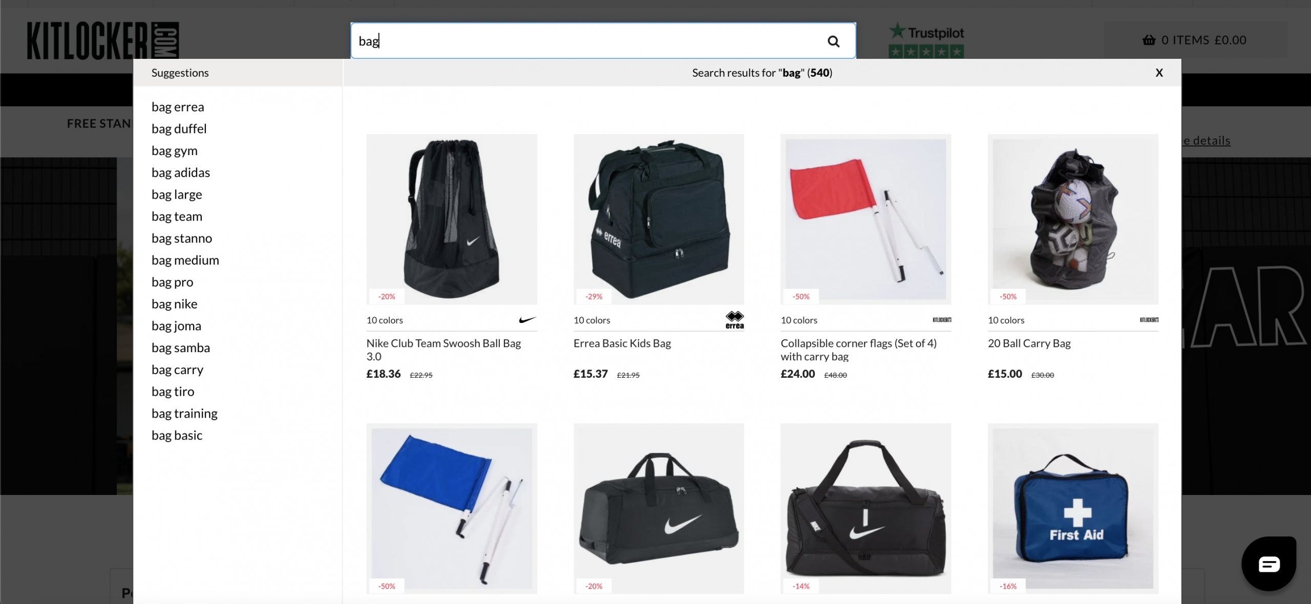
Kitlocker makes sure all relevant products show up when a keyword or synonym is used. Here, you can see entering ‘bag’ produces different types of bags relevant to the search intent.
11. Optimise for mobile
Delivering a seamless and intuitive mobile experience is key to engagement and a big part of m-commerce.
If mobile users find it difficult or frustrating to interact with your search box, you’ll lose sales.
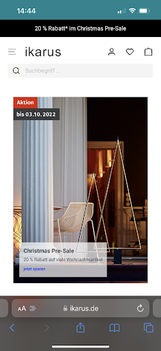
Take a gander at home and furniture store Ikarus Design’s mobile search. It takes centre stage on their mobile site, and it’s intuitive to use in just a few taps.
12. Add images and ‘buy now’ calls to actions to your product listings
Poor visuals is all it takes to deter your shoppers from making a purchase. On the other side of the coin, sometimes a nudge in the right direction can be the difference between a bounce and a sale. Provide a call to action on product listing, to accelerate the path to purchase, and provide a simple, easy, one-stop shopping experience.
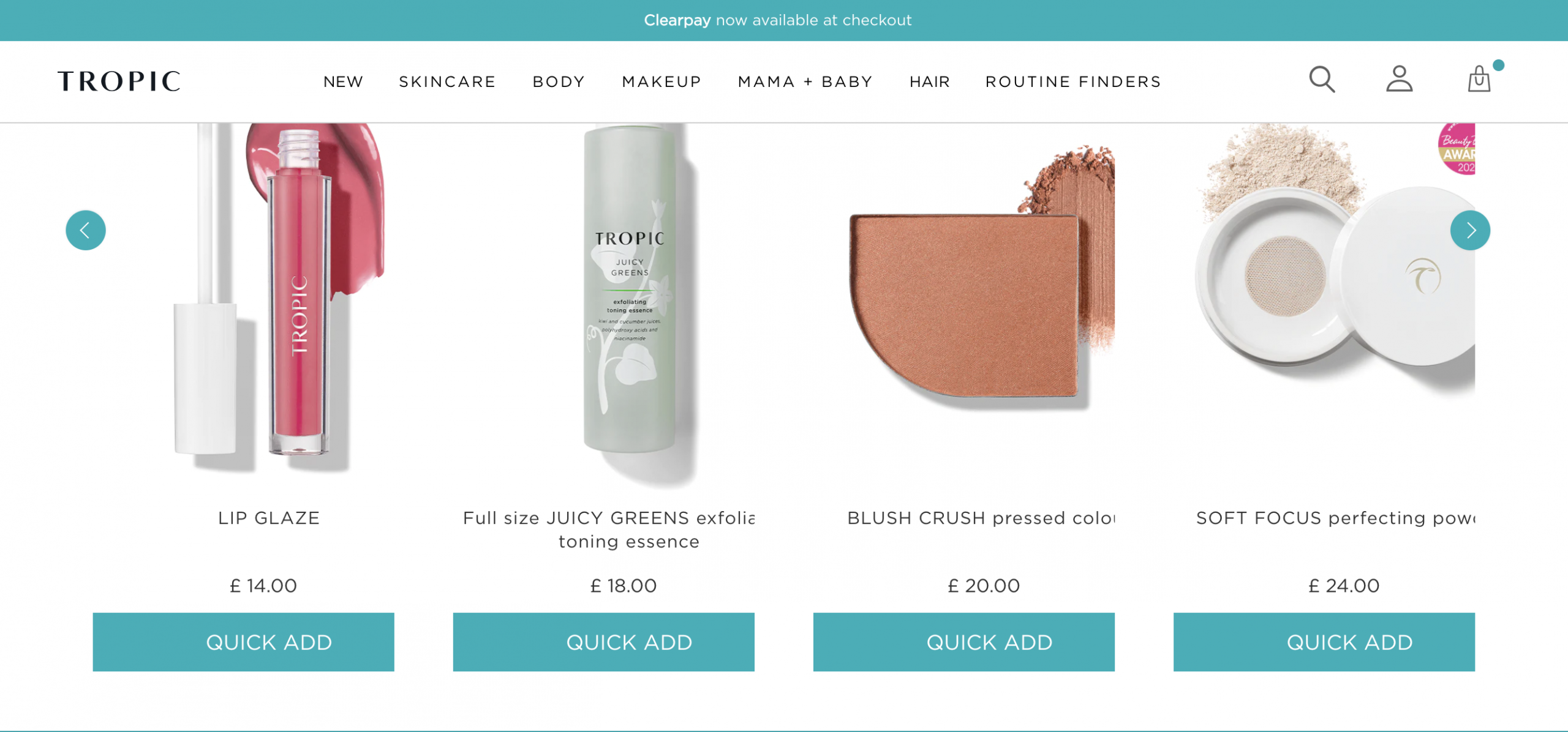
Skincare brand Tropic Skincare gets even more from their site search by empowering the shopper with calls to action on the product listings.
13. Provide relevant product recommendations
As a shopping assistant, it is also up to your search function to provide a range of products relevant to the user. Take a look at Casey Furniture’s ‘Customers Also Bought’ section that gives shoppers some valuable suggestions.
14. Fine-tune your SEO with site search analytics
Your search analytics report should tell you what the most frequently searched terms are for particular products or services on your site.
This’ll enable you to create content – be it landing pages, articles, or otherwise, that gives shoppers answers to the questions they have, and points them towards your products as solutions.
This targeted content will help you appear in organic search results for particular keywords, and also give your on site search function additional, highly related resources to draw from.
Choosing an Ecommerce Site Search Provider
Now that you have 14 examples of just some of the best search examples, how can you begin to implement some of these best practices and start seeing the benefits?
Well, all the examples above are actually Findologic users.
We believe at Findologic we are a premium on site search and navigation solution, offering:
- Assisted search
- One-click interaction
- Relevancy
- Merchandising
- Campaigns
- Analytics
- Personalisation
- Advanced filtering
- Categorisation
- Shopping guides
- A.I. virtual assistant
That’s just us, though. Depending on the ecommerce site search tool you decide to invest in, make sure:
- You place your search bar in a smart place that is useful for the shopper
- Add relevant keywords to your product pages and make sure you’re using tags!
- Include additional pages you want to show that are relevant to searches, such as articles, category pages, or gift guides.
- Provide filtering for your customers to get from A to B faster
- Regularly test your search function to make sure everything is running smoothly
- Improve search results using data and analytics
Reporting your ecommerce site search performance
If you’re still unsure about whether your ecommerce site search is truly optimised for conversions or sales, just ask yourself these questions:
- What are your shoppers looking for? How are they searching?
- What are your bounce rates?
- What are your heatmaps showing?
- What search terms are visitors using to find your products?
- Are customers finding what they’re looking for easily?
- How many people are using your search feature?
- What is your conversion rate? How many are making a purchase after engaging the search feature? What is the exit rate?
- What are the most popular filters?
- How can you improve the searching function?
The search bar is a lot more than a path from A to B. It is an invaluable resource that tells you so much about your customers and their journey throughout your site. Experiment, see what works for you. We at Findologic would love to help you on your journey.
If you want higher conversion rates, you know what to do.
Speak to us today.

