 User interface
Rethinking mobile design for the most nimble and seamless journeys
70% of the leading 19 online retailers deliver a poor on-site mobile experience. Instead of replicating the desktop interface on mobile, we adopt a mobile-first approach to support the contrasting flow states.
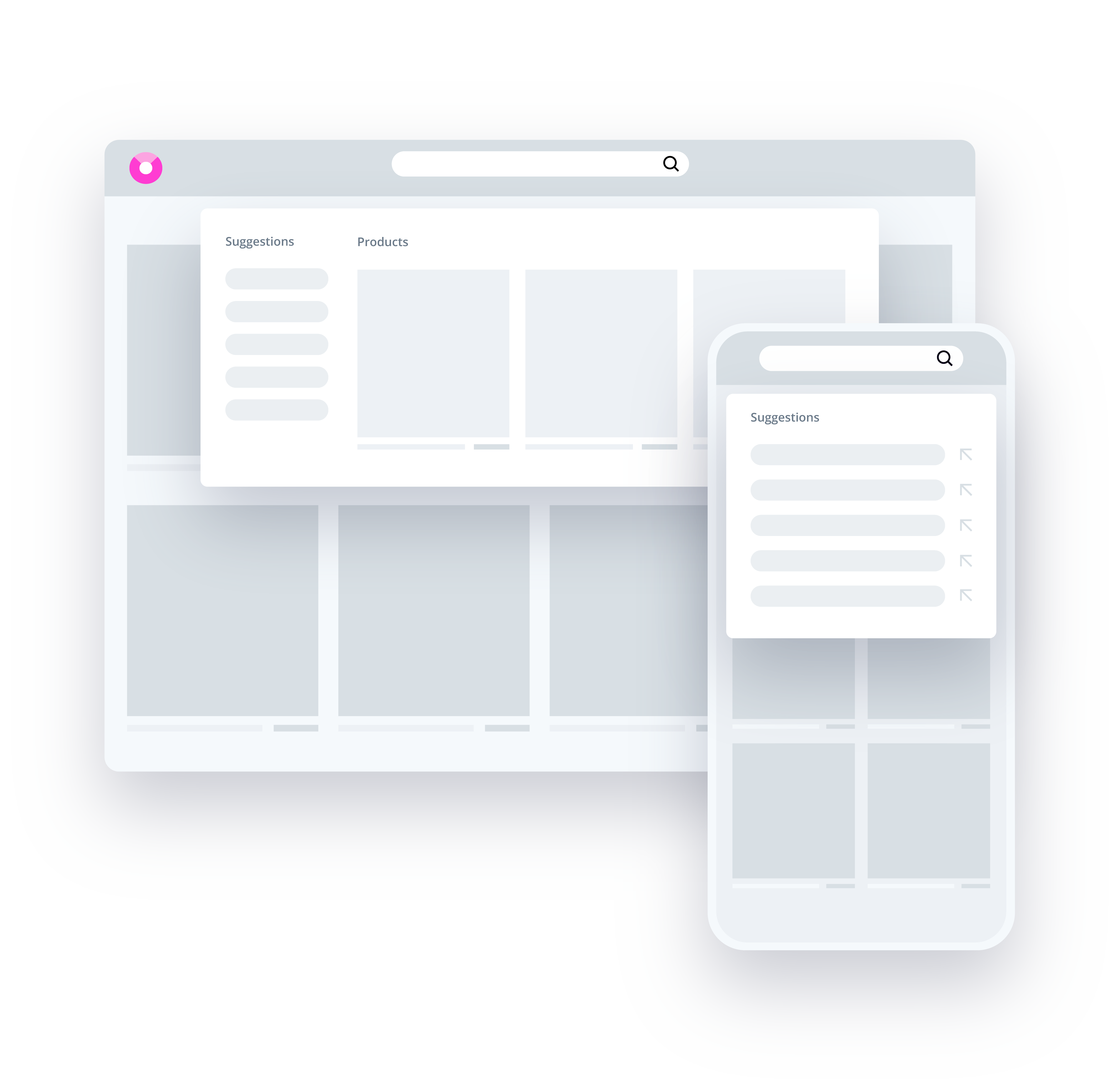
63% of mobile users will abandon a product or website as a result of preventable usability issues
M-commerce is taking over and even Google is ranking websites based on their mobile usability ahead of desktop. While mobile commerce presents a multitude of additional UX challenges due to limited screen real estate, which is Findologic builds mobile experienced completely independently.
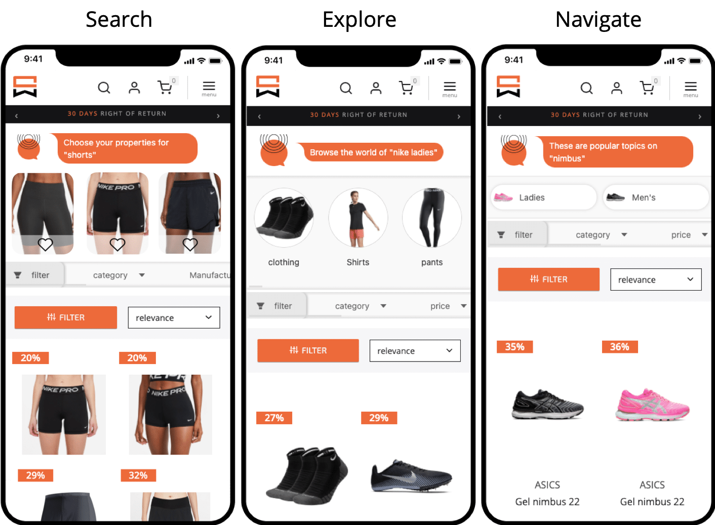
Findologic's Three Pillar Approach
We have broken down mobile UI into three categories: Search, Explore and Navigate. At each fundamental stage, the inherent tension between visual content, standard functional elements and text is eliminated, optimising every element of a browser's pathway to mobile conversion.
Deploy instinctive Touchpoints
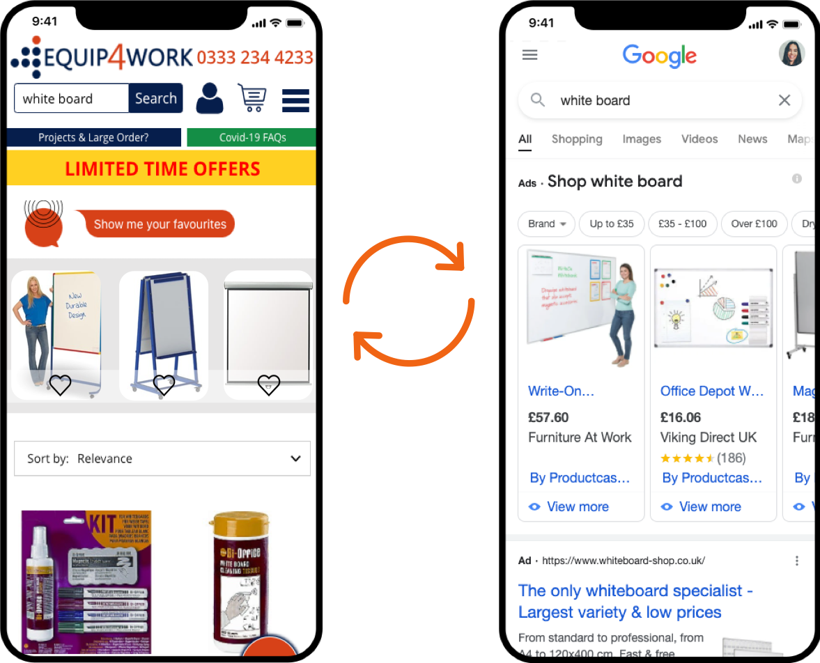
Replicate the familiar interface used by Google, Instagram, Facebook and Twitter to create a more subconscious experience. By deploying this, retailers are able to:
- Minimise discrepancies between the channels users interact with every day
- Provide a more instinctive and unconscious path to purchase
- Deploy instant touchpoints
- Engage dynamic and conversational navigation based on unique user requirements
Use A.I. to relieve users of navigational burden
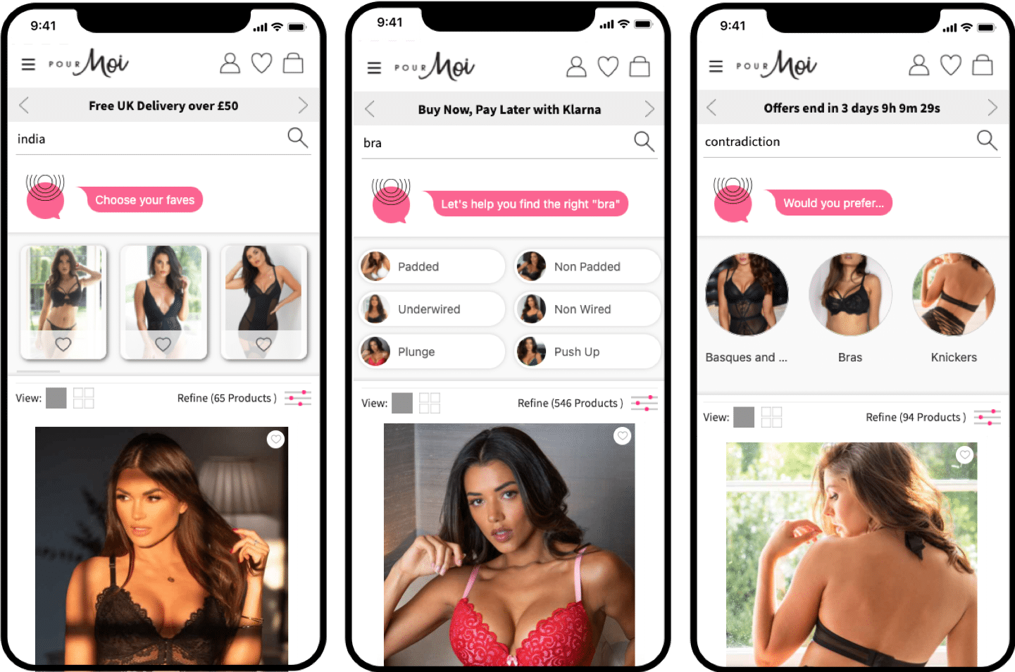
Product discovery can be cumbersome on mobile. Findologic’s A.I. takes the burden out of navigation so that your shoppers can sit back and enjoy relevant results. Our A.I. based shopping assistant, Li.S.A.:
- Profiles users to understand intent and adapt their journey accordingly
- Makes product recommendations more accurate with an instant touchpoint to refine vague search terms
- Deploys relevant UX to guide, inspire or discover
Smartphone Driven Features


Benefit today from our user interface!
We'd love to hear from you!
Case Studies
Customer Success Story:
With Findologic, Lucky Bike's conversion rate increased by more than 20%!
Lucky Bike - Why one of the leading bicycle retailers uses findologic
— Learn more

Customer Success Story:
Findologic offers service par excellence for every online shop!
Design Bestseller – How the online shop extends the search to a powerful on-site merchandising tool.